آخر المواضيع المضافة

 الفيزياء الكلاسيكية
الكهربائية والمغناطيسية
علم البصريات
الفيزياء الحديثة
النظرية النسبية
الفيزياء النووية
فيزياء الحالة الصلبة
الليزر
علم الفلك
المجموعة الشمسية
الطاقة البديلة
الفيزياء والعلوم الأخرى
مواضيع عامة في الفيزياء
الفيزياء الكلاسيكية
الكهربائية والمغناطيسية
علم البصريات
الفيزياء الحديثة
النظرية النسبية
الفيزياء النووية
فيزياء الحالة الصلبة
الليزر
علم الفلك
المجموعة الشمسية
الطاقة البديلة
الفيزياء والعلوم الأخرى
مواضيع عامة في الفيزياء| The Correlogram |


|
|
Read More
Date: 24-11-2020
Date: 28-12-2016
Date: 15-12-2016
|
The Correlogram
After computing the autocorrelation coefficient for about N/4 lags, the final step in analyzing actual data is to plot autocorrelation coefficient versus lag. Such a plot is a correlogram. Figure 1 shows some idealized time series (left column) and their corresponding correlograms. Figure 1a is the time series and correlogram for a sine curve. Figure 1b is a time series and correlogram for data that have no mutual relation. Figures 1c-e show other examples. The first important feature of these diagrams is this: for uncorrelated data (Fig. 1b), the autocorrelation coefficient is close to zero for all lags (except, of course, a lag of zero). In contrast, correlated data yield a correlogram that shows a nonzero pattern. The second important feature is that, to a large extent, the correlogram indicates or summarizes the type of regularity in the basic data.
For data with no trend and no autocorrelation, 95 per cent of the computed autocorrelation coefficients theoretically fall within about ±2/(N0.5), where N is the total number of values in the basic data (Makridakis et al. 1983: 368). Thus, about 5 per cent of the coefficients could exceed those bounds and the data could still be "uncorrelated."
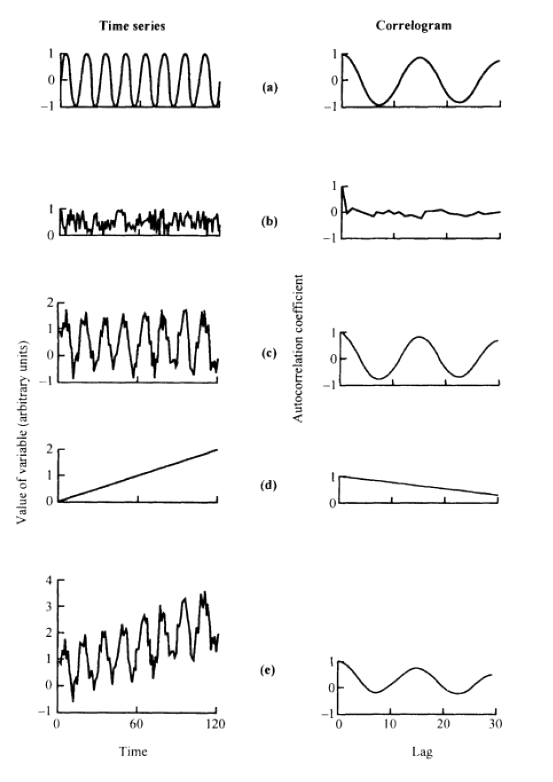
Figure 1: Time series and associated correlograms (after Davis 1986): (a) sine curve; (b) uncorrelated data (noise); (c) sine curve with superimposed noise (a+b); (d) trend; (e) sine curve with superimposed noise and trend (a+b+d).


|
|
|
|
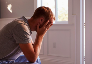
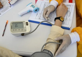
للعاملين في الليل.. حيلة صحية تجنبكم خطر هذا النوع من العمل
|
|
|
|
|
|
|
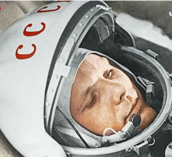
"ناسا" تحتفي برائد الفضاء السوفياتي يوري غاغارين
|
|
|
|
|
|
|
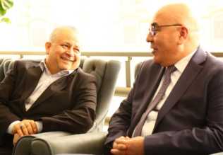
نحو شراكة وطنية متكاملة.. الأمين العام للعتبة الحسينية يبحث مع وكيل وزارة الخارجية آفاق التعاون المؤسسي
|
|
|